Shanghai House / INOUT2004
Inside is Outside / Reflections of Reality
Blending into the neighborhood
Inside is outside: Multi-layers / Reflections of reality
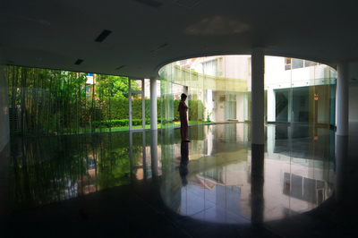
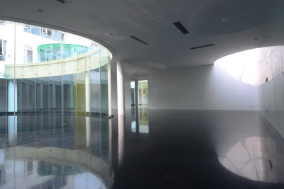
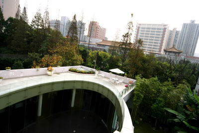
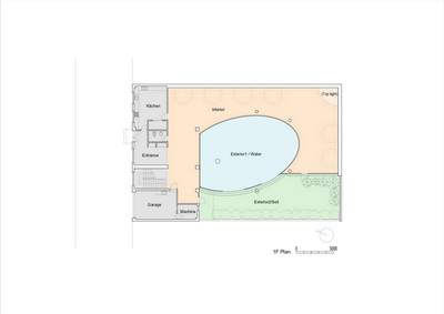
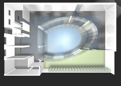
Incisions in the middle prevent closure of the space which surrounds the elliptical inner court.
The rooms which continue from the east side stop at a point about 1/3 into the west side, and the remainder is exterior and planting.
On the other hand, the glass screens which surround the court continue unbroken to form a closed ellipse. The court is paved in black granite, which continues from the interior.
When viewed from the planted exterior, the court appears to be part of the interior.
When seen from the interior, the court is exterior and the greenery beyond it appears to be interior.
From a viewpoint in the court, the black flooring of the rooms appears to be an extension of the court and the exterior greenery appears to be interior.
Interior and interior are continuous, severed, and overlapping.
The overlapping of these actually existing spatial layers is amplified in imagery by several screens.
There is a constant rearrangement here in the order of top and bottom, left and right, front and back, inside and outside.
Water: Reflections / Light and wind
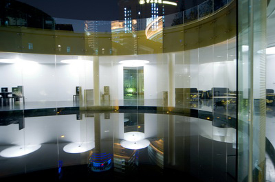
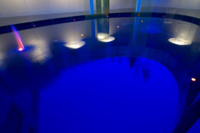
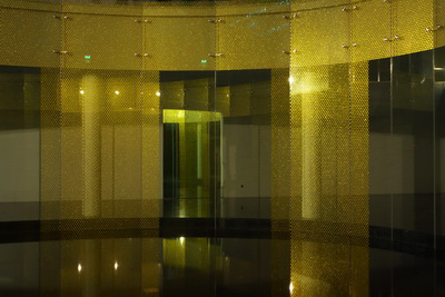
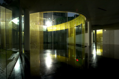
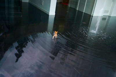
The court can be covered with water.
The glass screens were designed without base panels.
They rise directly out of the water, so that the reflection of the water is continuous with the water itself.
Like in Tokyo, summers in Shanghai are hot.
The water in the inner court should help lower the ambient temperatures in the summer.
At the same time, the surface of the water functions as a mirror to bring light into the interior. The interior is lit by light reflected from the ceiling and from the top light at the southeastern corner.
The character of the inner court changes depending on whether or not is covered with water. Without water, it is another room. With water, it is a reflecting mirror.
Architecture without a facade / Inheritance
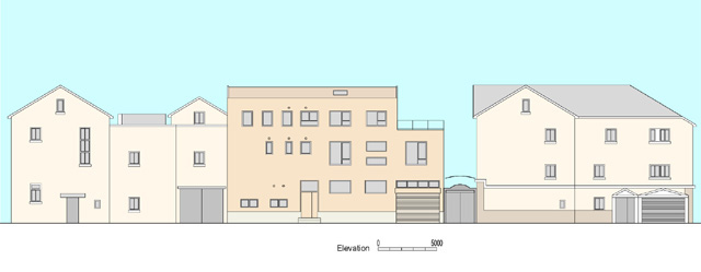
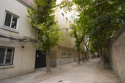
The site is in a district in central Shanghai with many residences dating from around the colonial period.
Out of respect for these historical circumstances, the street side is handled in a way that responds to the appearance of the surroundings. The height and depth are about the same as the height and depth of neighboring buildings. The slanted roof, window placement and use of color are also comparable. The street is narrow and lined with large trees, which makes it impossible to view the entire facade in one glance.
Rather than a work of architecture standing in the street, this residence gives the impression more of a fragmentary collection of walls, windows and colors glimpsed from between the trees.
In other words, it could be said that this architecture has no facade. Since the whole is never visible from any one point, more emphasis was placed on blending into the neighborhood as an accumulation of parts that functions as an element in the streetscape.
Combined with this three-story section on the street side is the one-storey section which surrounds the inner court.
Furnishings: New Chinese / Hybrid Shanghai
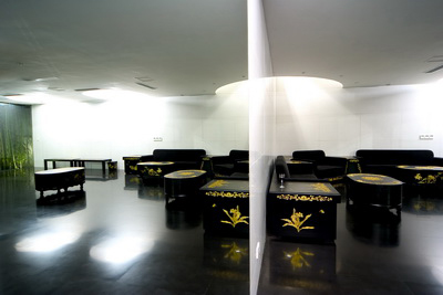
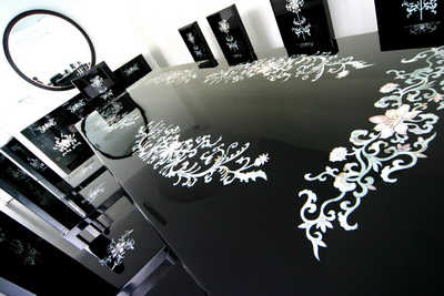
Although the architecture is handled neutrally, the furnishings display a definite style.
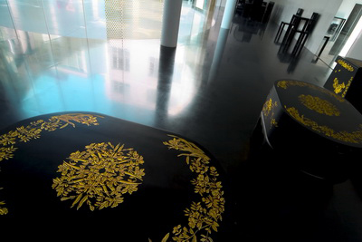
The furnishings of the first floor are black lacquer with two types of processing. One is relief work with gold dust, and the other is inlaid mother of pearl. Both are simple in form, but make special use of traditional Chinese technology and designs. Lacquer is sometimes referred to as "japan", but it is also part of traditional Chinese culture.
Unless one is careful, the rediscovery of such traditional skills can fall into so-called chinoiserie (or japonism, in the case of Japan). What appears to be most characteristic of a country to foreigners can be simply kitsch to natives of the country. But here in Shanghai such fears are needless. This is because modern Shanghai has always been an amalgam of different cultures.
Neither lacquer nor mother of pearl inlay can be made in Shanghai today. These skills from previous generations live on today only in distant cities where there are a few craftsmen still making the same things that they made in the past. It is quite possible that before long these skills may be extinct. By giving them new form, the way may be opened for their survival into coming generations. This was also an intention here.
Therefore these designs are not simply a resurrection of traditional styles. They are an attempt to apply genetic engineering to elements in Chinese tradition that should be passed down.
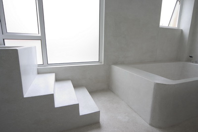
The same intentions are evident in the material used in the main bathroom in the upper storey. Floor, walls, bath, and counter were all created by a craftsman working patiently and painstakingly on site, grinding and polishing single pieces of artificial stone.
This craft is also in danger of being lost. An attempt was made here to find a new way to make use of it.
Whether it be the site or traditional technology, an intent in this project as a whole was to discover latent possibilities of the region and to further develop them.

