TOKYO HOUSE2006
OUTIN OUT INOUT / Two interiors and three exteriors
ALGOrithmic Design
Exterior Pattern generated by an Environmental Color Program
' Things decided, things not decided '
OUTIN OUT INOUT / Two interiors and three exteriors
One day, on the introduction of a friend, an elderly, quietly elegant woman appeared in my office.
She said, "Please make me a place to die."
That was a surprise. She continued, "Please make a house that can be cut in half after I die. For my two sons and their families."
This would not be so surprising if it were a commission for a grave. Architects do design graves from time to time. But this was a request for a house. A house is a place to live. What kind of house would have death as its primary requirement ?
I thought for a while.
Finally I realized that the request was actually "Please make a place to live better through the rest of my time."
A place to live, a place to enjoy life. That was my commission.
The requirement was not death, but vibrant "life".
That said, architects cannot design a way of life. We can only provide hardware, in the form of a house. So, what could be done in this case ?
Given the zoning regulations for the site, it would be a two-story house. The mother, my client, would live on the first floor, and the second floor would be the area for her two sons and their wives.
The permissible building-to-land ratio determined that the ratio of interior to exterior would be 1 to 1. But it would be boring to simply allocate half of the site to the interior and half to the exterior. I wondered whether it would be possible for the whole site to be interior and exterior at the same time. (This way of thinking about interior and exterior has something in common with the Shanghai House, an earlier project.)
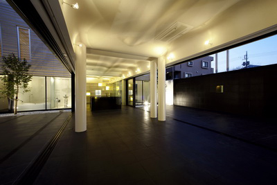
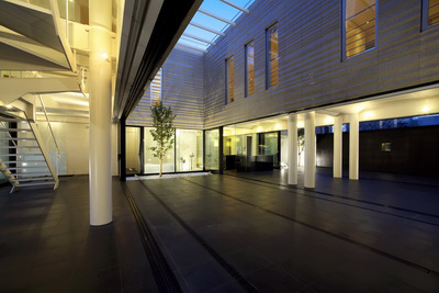
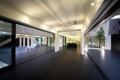
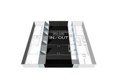
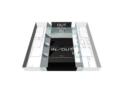
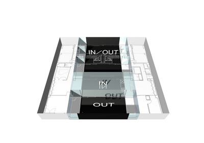
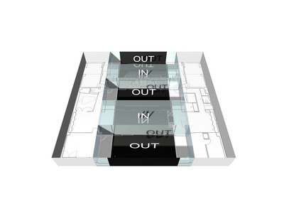
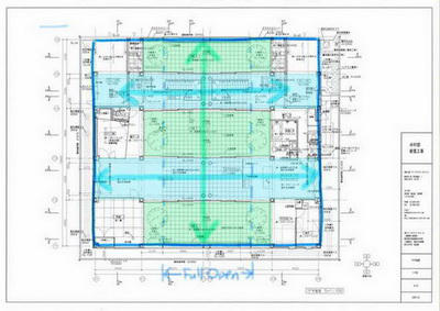
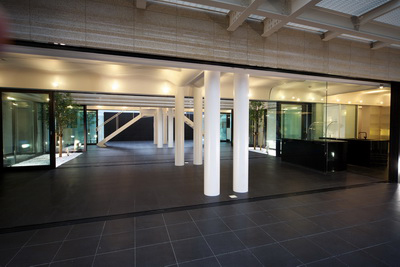
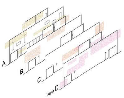
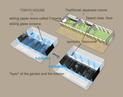
The solution was to "layer" the garden and the interior. Starting with units about 4.5 meters in width, I placed two interior units and three exterior units in a line, for a total of five layers.
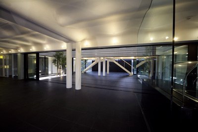
The entire sequence becomes one when the glass screens at the boundaries are all open. When the screens are all shut, it becomes a five-layer sandwich of interior and exterior. There are 16 combinations of opened/closed.
If each of the screens were further divided into its panes, there would be 2 to the power of 24 combinations.
There are as many plans as there are combinations.
The idea is to enjoy life amid these spatial variations as they play out against variations in the weather and season.
On a sunny morning with soft breezes blowing, a completely open space with no distinctions between inside and outside will be pleasant. On a rainy afternoon, the wet stones of the walls will be filled with light like the surface of a lake.
On a snowy evening, reflections from the snow between the rooms will make the ceilings glow in a pale gold color.
I thought that the solution for the commission, "a place to live", was to provide a place for creativity and discoveries.
Smooth continuity / Sliding doors
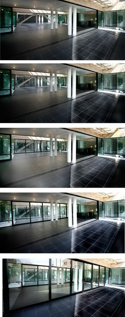
In traditional Japanese houses, rooms are divided by sliding paper doors called fusuma. (Sliding doors on the outer periphery are called shoji. These allow light to penetrate and are also made of paper.)
Doors on hinges are still there even when opened, but sliding doors disappear. The difference between On and Off is unmistakable.
Fusuma marks the boundaries between rooms and rooms, and between rooms and corridors, so that a sequence of rooms can be transformed into a single large room simply by opening the fusuma. Due to the post and beam construction of Japanese houses, only the pillars remain when the fusuma are opened.
By using sliding doors, this house affirms the unity of interior and exterior when all of the doors are opened.
The sliding doors can also be stopped at any point to select the degree of openness. The continuity between interior and exterior can be adjusted gradationally.
Continuity and separation / Floating drops of water
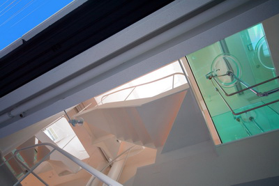
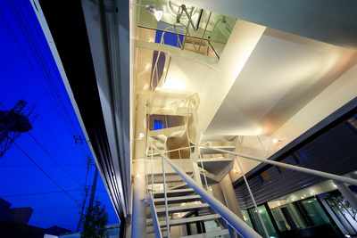
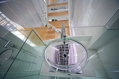
This house is a private home, but three families live there, so it also has something of the character of collective housing. Even though the families are not strangers, so the separation is not complete.
The first floor is used by members of all three families, and both staircases are in the same void. The two families on the second floor are visually connected across the glass washrooms that face the void. (You can't go to the other side, but you can see it.)
Continuity across private spaces (the washrooms) is possible only because the residents are members of the same family. When someone wants to block a line of sight, it is also possible to lower one of the two large electrically powered blinds in the void down the first floor. A combination of IN/OUT is available here as well.
The washstands on the second floor jut out into the void. As you are washing your face, you can see the first floor through the water in the basins. According to one of the second floor residents, this is an interesting experience every morning. When seen from below, drops of water appear to be floating overhead.
Waves and flow / Vibrations devices
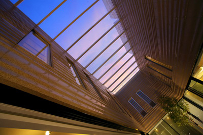
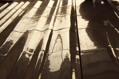
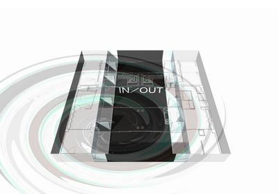
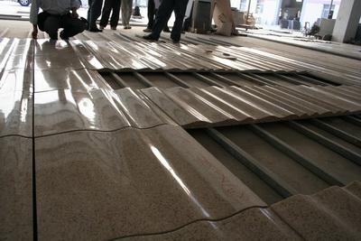
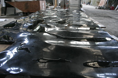
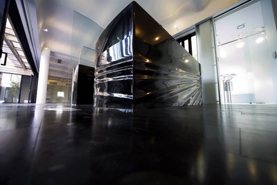
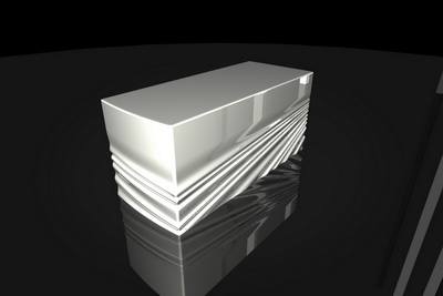
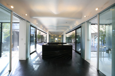
Superimposed over the IN/OUT configuration are waves emanating through this architecture. There are flows evident in the outer walls of the garden, the ceiling of the main room, the tokonoma, the kitchen, the water drops of the washrooms, the railings of the stairs, and the furniture.
If the various interior and exterior plans, configured according to the requirements of the moment, serve as an invitation for "wind" to flow through the building, then you could also say there is a corresponding flow of "water", which expresses itself as waves.
The ceiling of the main room encloses the beams in a gently curved surface.
The ceiling is white, with sprayed on copper powder to pick up the light.
Depending on the angle of the incident light, you may notice a delicate glint, a kind of subdued radiance.
The walls facing the garden have wavelike patterns in amber colored granite.
Three types of section shape were combined here. The wavelike surface has its intended effect when it catches the light. The angles of the surface were calculated on a computer by simulating the light that actually strikes the walls during the summer and winter and checking the reflections produced Glistening, breathing light and textures are common elements in the handling of stone in this house.
There is nothing very interesting about hard things that look hard. Paradoxically, they look harder when you can sense something soft about them. This is also a way to bring out the latent strengths in materials when there are stronger and more attractive forces at work beneath the surface.
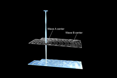
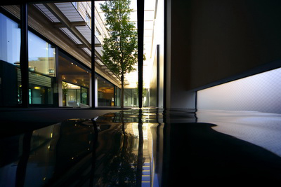
The black granite of the tokonoma in the Japanese room ripples like the surface of a body of water.
This surface rippling was reproduced on a computer as the interference between the concentric waves of two adjacent circles.
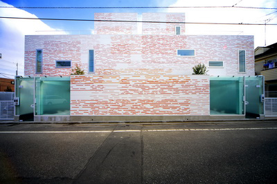
The two counters in the kitchen are also wavelike. They are places for cooking, which is related to the sense of taste, so they were designed as objects that go beyond the sense of sight to provide a tactile response, making you want to touch them. The walls around the site are painted with layers of six wavelike patterns in four colors.
The basic patterns were based on hand drawn lines, not digital ones, because I did not want to lose the subtle wavering of analog design. The subsequent processing was digital. The arrangement of colors responds to the distribution of colors around the site. A new Environmental Color Program (part of the INDUCTION DESIGN series) was developed tofacilitate this.
The aim of the program is harmony with the surrounding environment. But it does not attempt to find colors that vanish completely, like the camouflage of an insect. The colors must be in harmony with the environment, and at the same time assert their independence.
Instead of one alternative, this architecture is both. Ambiguous diversity is one of its fundamental characteristics. (However, the colors were not generated entirely by the program, since it was not completed in time for the construction.)
If the tokonoma is the symbolic device at the heart of a traditional Japanese room, the waves emanating through this architecture perform the same function for the house as a whole.
Wavering at the center / Tokonoma
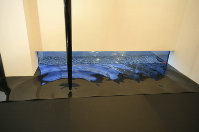
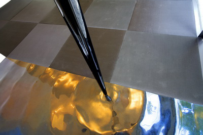
The tokonoma is a space found in traditional Japanese rooms. About the size of one tatami mat, it has a symbolic function and a history that are said to go back about 600 years. Normally it is raised slightly above the level of the tatami mats and floored with planks of expensive, carefully selected, and beautifully grained wood.
In this space stands a post called the tokobashira, usually an ornamental wood pillar that is polished smooth to emphasize its subtle curves. It is forbidden to step on the floor of the tokonoma.
The tokonoma is more than simply a background for the display of flower arrangements or hanging scroll brush paintings.
The very existence of this small space lends tension to the room and expresses its character. The rank of residents and visitors is evident from where they sit relative to the tokonoma.
In terms of providing a focal point in the room, the tokonoma plays a role similar to that of the fireplace in Western architecture. Unlike the fireplace, however, the tokonoma has no utilitarian function. Its only function is symbolic.
And although it serves as the room's center of gravity, it is located away from the room's axis. Moreover, its layout is usually asymmetric.
This is an interesting phenomenon, in that the center of gravity is not at the center.
It is difficult for something with a displaced center of gravity to be at rest. On the contrary, it will generate movement. Even though it appears to be simply a quiet space at the edge of the room, it is actually a dynamic factor, a vibration device that continually disturbs the stasis of the room. It is still, but moving. There is ambiguity here as well.
In the Tokyo House, the tokonoma is the rippling on the surface of the water, and the tokobashira is handled as a trickling (highly viscous) liquid.
What the designer did / What the residents decide
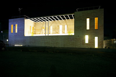
The residents report that they enjoy the opportunity to create spatial variations, opening and shutting different glass screens on different days.
They say they never grow tired of the play of light and shadow on the ceilings according to the time of day and the season.
In that sense, this house has more than one plan.
In that way, the residents decide what the house will be at any particular time.
What the designer did was to provide a number of plans in a single work of architecture, and to implant vibration devices that would generate waves at various locations within it.
Under the influence of changes in light and perspective, waves on the static stone ripple and move.
If the residents can select different plans from time to time, and feel that those times and those illuminations are beautiful, while surrendering to the gentle rocking of the waves, then perhaps the designer will have fulfilled the client's requirements.
- Movie
